Today’s letter is brought to you by Epum!
ResiClub has a new data partnership with Epum, a real estate research lab which is focused on tracking commercial real estate projects—including single-family rental and built-to-rent—in planning or under construction nationwide.
Epum’s platform is the definitive resource for tracking, visualizing, and analyzing parcel-level site plan approvals, rezonings, and special exceptions for new housing or other CRE projects in planning.
All ResiClub readers are welcome to use the ResiClub discount code (ResiClub22025), to receive 10% off when subscribing to Epum.
You can watch Epum’s product demo here.
When assessing home price momentum, ResiClub believes it's important to monitor active listings and months of supply. If active listings start to rapidly increase as homes remain on the market for longer periods, it may indicate pricing softness or weakness. Conversely, a rapid decline in active listings could suggest a market that is heating up.
Generally speaking, local housing markets where active inventory has returned to pre-pandemic levels have experienced softer home price growth (or outright price declines) over the past 30 months. Conversely, local housing markets where active inventory remains far below pre-pandemic levels have, generally speaking, experienced stronger home price growth over the past 30 months.
How is inventory shaping up in 2025? As ResiClub communicated to ResiClub PRO members in late 2023—and reaffirmed last fall—we expect national active inventory to approach pre-pandemic 2019 levels in the second half of 2025. That’s still the trajectory we’re on.
National active listings are on the rise (+30.6% between April 2024 and April 2025). This indicates that homebuyers have gained some leverage in many parts of the country over the past year. Some sellers markets have turned into balanced markets, and more balanced markets have turned into buyers markets.
Nationally, we’re still below pre-pandemic 2019 inventory levels (-15.6% below April 2019) and some resale markets, in particular big chunks of Midwest and Northeast, still remain tight to tight-ish.

April inventory/active listings* total, according to Realtor.com:
April 2017: 1,198,424 📉
April 2018: 1,102,064 📉
April 2019: 1,137,198 📈
April 2020: 941,733 📉
April 2021: 435,663 📉 (overheating during the Pandemic Housing Boom)
April 2022: 379,978 📉 (overheating during the Pandemic Housing Boom)
April 2023: 562,966 📈
April 2024: 734,318 📈
April 2025: 959,251 📈
IF we maintain the current year-over-year pace of inventory growth (+224,933 homes for sale), we'd have...
1,184,184 active inventory come April 2026
1,409,117 active inventory come April 2027
Today, we’re looking at state inventory data. Tomorrow morning, ResiClub PRO members (paid tier) will get our monthly deep dive analysis looking at inventory shifts and signals for over 800 metro areas and 3,000 counties.
Below is the year-over-year percentage change by state.
Click here to view an interactive version of the year-over-year map below

While active housing inventory is rising in most markets on a year-over-year basis, some markets still remain tight.
As ResiClub has been documenting, both active resale and new homes for sale remain the most limited across huge swaths of the Midwest and Northeast. That’s likely where home sellers this spring will have more power.
In contrast, active housing inventory for sale has neared or surpassed pre-pandemic 2019 levels in many parts of the Gulf region, including metro area housing markets such as Punta Gorda and Austin. These areas saw major price surges during the Pandemic Housing Boom, with home prices getting stretched compared to local incomes. As pandemic-driven migration slowed and mortgage rates rose, markets like Tampa and Austin faced challenges, relying on local income levels to support frothy home prices. This softening trend is further compounded by an abundance of new home supply in the Sun Belt. Builders are often willing to lower prices or offer affordability incentives to maintain sales, which also has a cooling effect on the resale market. Some buyers, who would have previously considered existing homes, are now opting for new homes with more favorable deals.
Click here to view an interactive version of the map below

At the end of April 2025, 9 states are above pre-pandemic 2019 active inventory levels: Arizona, Colorado, Florida, Idaho, Hawaii, Tennessee, Texas, Utah, and Washington. The District of Columbia is also above pre-pandemic 2019 inventory levels (The District of Columbia—which we left out of this analysis—is also back above pre-pandemic active inventory levels too. Weakness in D.C. proper predates the current admin’s job cuts).
Click here to view an interactive of the chart below (best done on desktop)

Big picture: Over the past few years we’ve observed a softening across many housing markets as strained affordability tempers the fervor of a market that was unsustainably hot during the Pandemic Housing Boom. While home prices are falling in some areas around the Gulf, most regional housing markets are still seeing positive year-over-year home price growth. The big question going forward is whether active inventory and months of supply will continue to rise and cause more housing markets to see price softening?

Below is another version of the table above—but this one includes every month since January 2017. (Sorry if it’s a little blurry—click the interactive link to see a version that isn’t blurry)
Click here to view an interactive version of the chart below

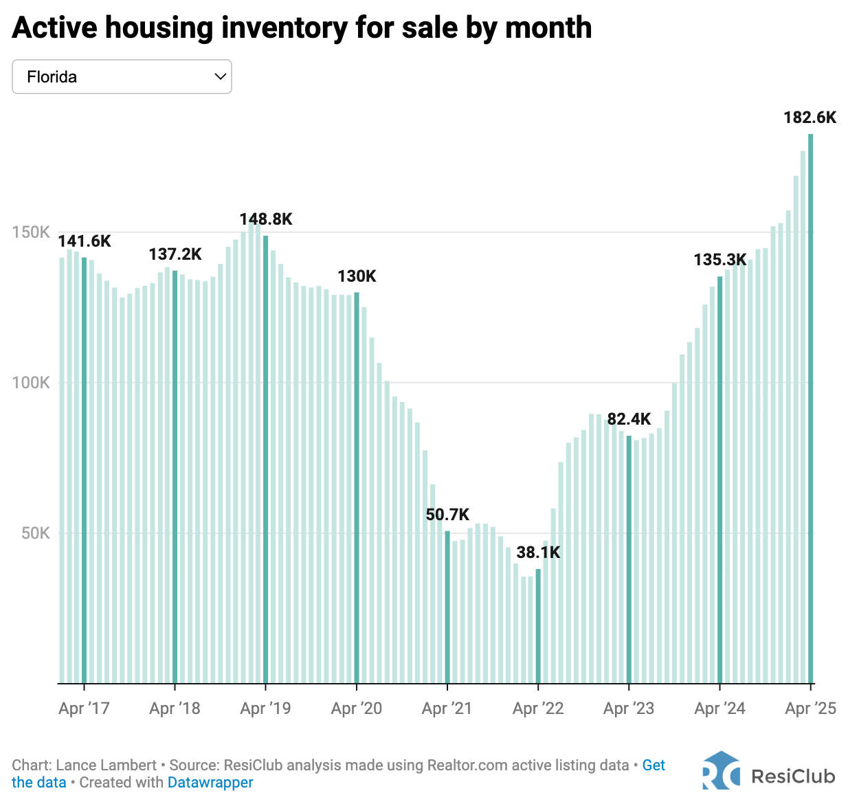
If you’d like to further examine the monthly state inventory figures, use the interactive below. [To better understand ongoing softness and weakness across Florida, read this ResiClub PRO report].
Click here to view an interactive/searchable version of the chart below

All the charts above show active listings*, or everything currently for sale. Actives are mostly rising year-over-year because demand has cooled and homes are taking longer to sell—not because there’s a big surge in new listings.
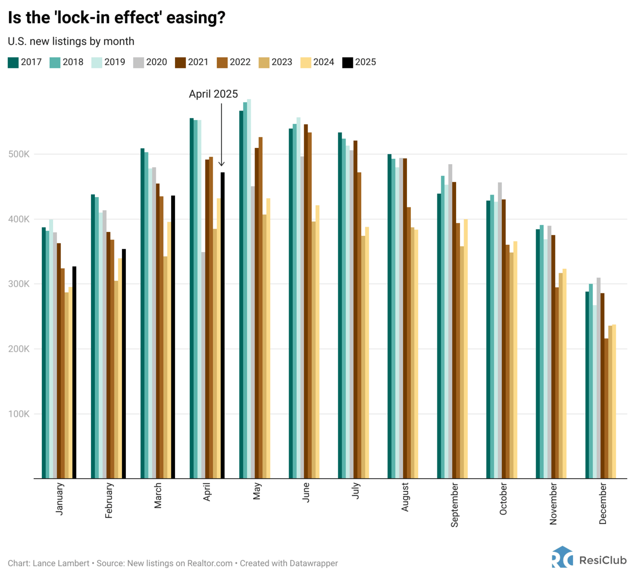
In fact, here’s a look at the national chart for new listings**, which remain suppressed due to the lock-in effect that continues to constrain resale turnover. Many homeowners who would otherwise like to sell and buy something else are still opting to stay put to avoid losing their lower mortgage rate/monthly payment.
That said, the “lock-in effect” could be easing up…
Look at the number of new listings in April 2025. If new listings rise this year, it’ll create an opportunity for existing home sales to increase some. However, if the increase in new listings isn’t matched by higher housing demand, active inventory could climb above its current trajectory. We’ll keep an eye on it.

* Active listings (i.e. what ResiClub often calls “inventory”) = “The count of active listings within the specified geography during the specified month. The active listing count tracks the number of for sale properties on the market, excluding pending listings where a pending status is available. This is a snapshot measure of how many active listings can be expected on any given day of the specified month” according to Realtor.com.
** New listings = “The count of new listings added to the market within the specified geography. The new listing count represents a typical week’s worth of new listings in a given month. The new listing count can be multiplied by the number of weeks in a month to produce a monthly new listing count” according to Realtor.com.
